Wednesday, November 17, 2010

Reading Comprehension 6.

1. Art Nouveau comes booming onto the scene in countries all across Europe and in the United States. Although the main idea behind the design period was to ‘divorce the past’, it did not do that entirely; Art Nouveau took the fluid, nature-like influences from Eastern Nations, such as Japan and China, as well as Islamic cultures. This design era breaks out of the mold of typical structural design and using these influences, materials (such as concrete) were allowed to do what they naturally wanted to do, and be curvilinear, such as the Casa Batllo and Casa Mila in Barcelona by Antonio Gaudi. Curvilinear influences didn’t stop there; ironwork also became a decorative element that influenced the entire facade of buildings, such as these shop fronts in Belgium and France.

Harwood, pg 497
Harwood, pg 499
Harwood, pg 488

2. Le Corbusier’s Villa Savoye takes inspiration from the machine itself, designed from the angle of rotation of the 1927 Model Car. This residence exemplifies less is more, showing Corbusier’s ‘Five Points of Architecture’ (Pilotis, Ribbon Window, Free Plan, Roof Garden, and Inspiration from Machine). The structure even ran like a machine, having ramps linking levels so that one may have an experience, instead of a hike up the stairs. These things come together to prove that the ‘less is more’ dictum is, in fact, a guideline that modernists of the early 20th century lived by. There was minimal color, a high implication that one needed to be clean, and smooth surfaces, lines, and grids that guided you through the building. This “simple” design concept of an unrestricted interior was vital to the Modernist Movement.

Massey, pg 81

3. The Tugendhat House, designed by Ludwig Mies Van Der Rohe, was completed with luxurious, yet plain materials. White linoleum and steel encompassed the space; the only ‘warm’ aspect is the curved dividing wall. I manipulated the space by increasing the richness of the wood by adding more natural colors.

Tuesday, November 16, 2010

The Final Johnson Wax Project.


For our final building project, we had to have a 6 minute powerpoint presentation discussing one thing that is not so easily explained. I chose to talk about the lighting and divided it into the innovative materials, the problems that came from that, and the aesthetic effects that came from the lighting itself. Here's a few screen shots from my power point explaining my presentation :).

Booklet!


These are some rough screenshots of my 4 spreads in our group booklet. We just recently got it mailed in and I'm really happy with the outcome! It was really cool to work with an actual bookmaking site, no matter how frustrating, and it was cool to work with indesign and see 5 different buildings come together cohesively.

Presenting to a Client.

Our last individual board for our specific buildings were geared more towards the client and how they would perceive a display. I chose to work with colored pencil with a watercolor wash. I have two interior perspectives, one exterior perspective, two floor plans, and one site plan. I decided to include more documentation than I ever have so I can highlight further on the building and its innovative history.

Diagramming the Johnson Wax.

This board shows different ways to view the Johnson Wax Building. Some in a more gestural form compared to others. Below are some models that correlate to the diagrams on the board.
Circulation to Use.
Building to Site.
Natural Light to Form and Space.
Structure to Enclosure.
Unit to Whole.
Material to Form.

Thursday, November 11, 2010

Reflections Summary.

As for reflections, I looked upon Nikki, Austin, and Cassie. Nikki talked about cycles and how we constantly borrow and evolve from the past in order to create new designs. I really liked that she mentioned that we were hoarders of the past, looking for new ways to use the old. It's so true and such a good way to put it! Austin focused on the many different design movements and design languages throughout the 19th century. Although it does bring ideas from the past, it also manipulates them in such a way that a new template can be created. Cassie questioned what was 'good' design. Design, in this unit, was no longer for the rich, but for the middle class and everyday person. So many options were arising that people now had an option in which direction to go. Just like other posts, it focused on the variety of design languages that were beginning to emerge.

This was posted on Austin's blog, exemplifying the point that although it may be the same impact to the water every time, the journey is forever changing.

Alternatives Summary.

I looked on the blogs of Anna, Daniel, and Blakeni. They all focused on how this unit was about going outside the boundaries of what was known and twisting design into something new and fresh. Anna focused a lot on the cathedrals and how they used the beauty to bring people in rather than the rules of the time, that the architects were changing the views of the church in big ways. Daniel spoke of the renaissance and baroque, especially how the baroque was a twist from renaissance. The designers of the baroque time took the regulations of the renaissance and stretched and skewed them until it was a theatrical and intensified atmosphere. Blakeni wrote of how these new innovations were built from the importance of reformation, unity & harmony, and rebellion. The emergence of these things requires you to break out of the box and break into something new.

Blakeni used this as her image, showing that "Design is like a cartwheel. Starting at one point, then turning, stretching, shifting, reshaping and fixing back into place after your whole view on the world has been turned upside down". Which I think also directly relates to everyones post as well as the unit as a whole.


Monday, November 8, 2010

Reflection.

As America develops, so does its architecture. Revival of classicism, Palladian, roman, and Greek styles are heavy among the designs of the building of our country. Many capitols being built were remnant of the Parthenon and other Greek temples, to show the importance of the independence and strength of the new United States Government. Also around this time period industrial buildings became more popular, especially with the emergence of glass and iron.

In 1851, the emergence of new materials and technology came on the scene. Places like the Crystal Palace paved the way for new types of buildings to manipulate iron and glass in a way to expand the amount of area a building can cover. The Crystal Palace showed many different design languages and through that, it was apparent that this building was looking both forward and backwards. This idea was new to the people of London, but it caught on like wildfire. This translated across to the United States to various train stations and public buildings around major cities. The use of iron was pushed even further into the interiors of spaces, using the material in furniture and other decorative pieces, as well as interior structural focal points.

As the emergence of materials and technology effects design, so does the influence of other cultures. The impact of the east on the western cultures brought on a whole new design language. The Royal Pavilion brought to the scene something people have never seen before in Europe. This building was highly polychromatic, with many layers of decoration. Also it looks like someone picked it right out of India and dropped it in the middle of England. We know now that this became such a distraction that the Queen had to change buildings and make that specifically a tourist location. I wonder if that’s what’s holding back creativity. Maybe people don’t want to spark distraction among the town, or don’t want to pave the way to some new design language and things don’t get created.

When the east influences the west and America begins to develop, designers all around attempt to push the envelope and begin revolutions. But that brings up the question…what starts a revolution? Revolution can begin with things such as politics, the booming of new materials and technology, clothes, music, literally anything. These things start a stir in the architectural and design world and we are still seeing revolution in today’s society as well. The reflections unit has solidified for me; the notion that revolution is forever present in our everyday lives and our standards of what is modern is never a sturdy ground to walk on.

http://www.dimensionsguide.com/wp-content/uploads/2009/11/Rubiks-Cube.png

I chose this image of a rubix cube to represent this unit because, in my opinion, I think it represents how the different design languages can come together to create something very cohesive. But at the same time, you can mix it up, turn it all around and view it from different angles and perspectives…just as the designers of the time were doing.

Wednesday, November 3, 2010

Reading Comprehension 5


1.
I chose iron bed (found Pg 29 ; Fig 1-46 ; Harwood II) because it represents revolution in not only its structural materials, being an entire revolution in itself. But also it's bedding materials. Due to power looms and dye technology, more people now had the opportunity to have luxury inside their bedrooms, where in the past only the very wealthy could obtain these things.

2. ARTIFACT:
Eastern influenced more than just designed a home, but what decorated the home as well. This china piece is a direct reflection of the eastern effects on the west. The nature of eastern culture leaks into western culture and these patterns and designs that appeared on the china, also appeared on things like wallpapers, window treatments, decorative motifs on furniture, etc. I decided to show another artifact of a textile to further exemplify the fact that the naturalistic culture moves from one decorative artifact to another.

SPACE:
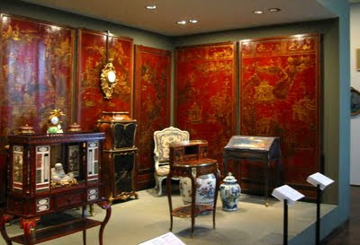
This chinoiserie gallery in the Louvre depicts the eastern influence in everyday life. Much like the peacock room in our readings and what we've learned about in class, when we adapt the eastern to our culture, we tend to frame in the exotic, like it needs to be contained. Just as we're seeing here. We see in the gallery piece above, the heavy influence of the deep red underneath the gilded art, as well as the compartmentalized furnishings with the same art depicted.

BUILDING:
The Sezincote House in Gloucestershire combines the Italian languages of design as well as the Indian. It is also the inspiration for the famous Royal Pavillion in Brighton. Taking Hindu and Muslim background, a beautiful and exotic centerpiece was created.

PLACE:
Tatton Park's Japanese Gardens were influenced by an exhibit in London on the Japanese. It's obvious that this park is screaming Japanese culture as well as eastern influence. All the artifacts, the statuary, the water scenes, etc are direct relations of the Japanese and the naturalistic lives they lead. It represents the harmonious bond they share with nature.