Friday, December 10, 2010

Point:Explorations.

A prominent theme in this class, for me, has been evolution. Everything has been a building block for the next style to come. Whether the era is rejecting the past or accepting it wholeheartedly, it’s forever present. One thing that I didn’t necessarily realize right off the bat is that it can go as far back as time will tell. For instance, the College Life Insurance Building has ties to the pyramids of the Egyptians, in both stature and roughly the idea behind it.

That’s another thing that this unit opened my eyes to. Post-modern buildings began to represent what they were building for. Like the TWA terminal, as well as other airports, resembling flight. I was actually driving down to Anderson, S.C. yesterday and realized that this isn’t just obvious in class, but it’s everywhere. I saw a Michelin Tires Company Building that was structured to resemble tire treads. This class has really taught me to open my eyes, and I truly appreciate that.

As well as representing what the building was used for, buildings were building on the past by using past building techniques; in design and in construction. The hotels began adopting the atrium style, which is obviously taken from Pompeii and places like the House of Vettii. But then you have the Church of the Light, which is an abstraction of the churches of the medieval times, in that the light creates the religious experience and the intensity of it. Then, there are things such as New Baris by Fathy, which takes ancient building practices and literally makes bricks from sand to construct the buildings. The past is a constant present in our everyday lives; we just have to take the time to notice it.

I’ve decided to take this post into a new direction and instead of talking mainly about the unit; I want to talk about the class as a whole. It’s a time of reflection for me. The last class was a time of communication and open thoughts and although I didn’t say anything, I just took everything in. I was thinking the whole time that I have been to Europe, yes, and I have seen some of the buildings, yes. It was cool to be in class and learn about them post-fact. But now, I just can’t wait to get back into the world and experience them again. Being in the class, as well as an Interior Architecture major in general, makes me have such a thirst for travel and experience of what is truly out there. As Patrick did say, ‘Looking at the world requires you to be in it.’ I can’t wait to go out into the world, and just like the Michelin Building yesterday, put my knowledge of the class on a larger scale. Thank you.

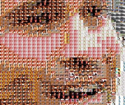
I chose this image, of a typical face collage, to show that everything now is parts of a whole. There are always tiny pieces to the bigger picture. You just have to look deeper to find it, and you will.

Friday, December 3, 2010

Reading Comprehension 7.

The work and commerce section of the “Greensboro Collects”, in my opinion, was a very lucky pick for this section. It shows work ethic, different uses of materials, and different ways to perceive work and commerce, which is exactly what this unit is talking about. Minimalism is all about finding different ways to display the architect’s work ethic, using different materials, and looking through a brand new looking glass. It’s about being “stripped to its fundamentals…and eliminating everything nonessential.” [Harwood, pg 806] I chose to focus on Willie Cole’s “Knapp Monarch”, which is a sculpture made of iron and iron parts mounted on a wooden base. To me, it instantly spoke to me and the rise of modernism. This is diagrammed, here, to show this rise… starting with the sturdy wooden base of classicism, then going to the upbringing of modernism, then to the refinement of the minimalist.

The other work of art I looked at was Fernand Leger‘s “Les Constucteurs“. This is a color lithograph, which I believe further represents the twist the art and architecture can have on work and commerce. As Roth states, “many contemporary expressions of modernism…reflect regional desires and needs…they respond to divergent theories on the role of architecture, coupled with the emerging changing in how buildings are conceived and designed.” [pg 612] This piece was different from the rest; yet spoke the same kind of language, which continues to be a challenge for contemporary design. Just as both of these pieces changed the concept of art to some and impacted the collection in a different light, so did minimalism. “Function, efficiency, and practicality no longer solely define concepts, so designs are often innovative, individualistic, monumental, and stand out within their environments.” [Harwood pg 806]

Wednesday, November 17, 2010

Reading Comprehension 6.

1. Art Nouveau comes booming onto the scene in countries all across Europe and in the United States. Although the main idea behind the design period was to ‘divorce the past’, it did not do that entirely; Art Nouveau took the fluid, nature-like influences from Eastern Nations, such as Japan and China, as well as Islamic cultures. This design era breaks out of the mold of typical structural design and using these influences, materials (such as concrete) were allowed to do what they naturally wanted to do, and be curvilinear, such as the Casa Batllo and Casa Mila in Barcelona by Antonio Gaudi. Curvilinear influences didn’t stop there; ironwork also became a decorative element that influenced the entire facade of buildings, such as these shop fronts in Belgium and France.

Harwood, pg 497
Harwood, pg 499
Harwood, pg 488

2. Le Corbusier’s Villa Savoye takes inspiration from the machine itself, designed from the angle of rotation of the 1927 Model Car. This residence exemplifies less is more, showing Corbusier’s ‘Five Points of Architecture’ (Pilotis, Ribbon Window, Free Plan, Roof Garden, and Inspiration from Machine). The structure even ran like a machine, having ramps linking levels so that one may have an experience, instead of a hike up the stairs. These things come together to prove that the ‘less is more’ dictum is, in fact, a guideline that modernists of the early 20th century lived by. There was minimal color, a high implication that one needed to be clean, and smooth surfaces, lines, and grids that guided you through the building. This “simple” design concept of an unrestricted interior was vital to the Modernist Movement.

Massey, pg 81

3. The Tugendhat House, designed by Ludwig Mies Van Der Rohe, was completed with luxurious, yet plain materials. White linoleum and steel encompassed the space; the only ‘warm’ aspect is the curved dividing wall. I manipulated the space by increasing the richness of the wood by adding more natural colors.

Tuesday, November 16, 2010

The Final Johnson Wax Project.


For our final building project, we had to have a 6 minute powerpoint presentation discussing one thing that is not so easily explained. I chose to talk about the lighting and divided it into the innovative materials, the problems that came from that, and the aesthetic effects that came from the lighting itself. Here's a few screen shots from my power point explaining my presentation :).

Booklet!


These are some rough screenshots of my 4 spreads in our group booklet. We just recently got it mailed in and I'm really happy with the outcome! It was really cool to work with an actual bookmaking site, no matter how frustrating, and it was cool to work with indesign and see 5 different buildings come together cohesively.

Presenting to a Client.

Our last individual board for our specific buildings were geared more towards the client and how they would perceive a display. I chose to work with colored pencil with a watercolor wash. I have two interior perspectives, one exterior perspective, two floor plans, and one site plan. I decided to include more documentation than I ever have so I can highlight further on the building and its innovative history.

Diagramming the Johnson Wax.

This board shows different ways to view the Johnson Wax Building. Some in a more gestural form compared to others. Below are some models that correlate to the diagrams on the board.
Circulation to Use.
Building to Site.
Natural Light to Form and Space.
Structure to Enclosure.
Unit to Whole.
Material to Form.

Thursday, November 11, 2010

Reflections Summary.

As for reflections, I looked upon Nikki, Austin, and Cassie. Nikki talked about cycles and how we constantly borrow and evolve from the past in order to create new designs. I really liked that she mentioned that we were hoarders of the past, looking for new ways to use the old. It's so true and such a good way to put it! Austin focused on the many different design movements and design languages throughout the 19th century. Although it does bring ideas from the past, it also manipulates them in such a way that a new template can be created. Cassie questioned what was 'good' design. Design, in this unit, was no longer for the rich, but for the middle class and everyday person. So many options were arising that people now had an option in which direction to go. Just like other posts, it focused on the variety of design languages that were beginning to emerge.

This was posted on Austin's blog, exemplifying the point that although it may be the same impact to the water every time, the journey is forever changing.

Alternatives Summary.

I looked on the blogs of Anna, Daniel, and Blakeni. They all focused on how this unit was about going outside the boundaries of what was known and twisting design into something new and fresh. Anna focused a lot on the cathedrals and how they used the beauty to bring people in rather than the rules of the time, that the architects were changing the views of the church in big ways. Daniel spoke of the renaissance and baroque, especially how the baroque was a twist from renaissance. The designers of the baroque time took the regulations of the renaissance and stretched and skewed them until it was a theatrical and intensified atmosphere. Blakeni wrote of how these new innovations were built from the importance of reformation, unity & harmony, and rebellion. The emergence of these things requires you to break out of the box and break into something new.

Blakeni used this as her image, showing that "Design is like a cartwheel. Starting at one point, then turning, stretching, shifting, reshaping and fixing back into place after your whole view on the world has been turned upside down". Which I think also directly relates to everyones post as well as the unit as a whole.


Monday, November 8, 2010

Reflection.

As America develops, so does its architecture. Revival of classicism, Palladian, roman, and Greek styles are heavy among the designs of the building of our country. Many capitols being built were remnant of the Parthenon and other Greek temples, to show the importance of the independence and strength of the new United States Government. Also around this time period industrial buildings became more popular, especially with the emergence of glass and iron.

In 1851, the emergence of new materials and technology came on the scene. Places like the Crystal Palace paved the way for new types of buildings to manipulate iron and glass in a way to expand the amount of area a building can cover. The Crystal Palace showed many different design languages and through that, it was apparent that this building was looking both forward and backwards. This idea was new to the people of London, but it caught on like wildfire. This translated across to the United States to various train stations and public buildings around major cities. The use of iron was pushed even further into the interiors of spaces, using the material in furniture and other decorative pieces, as well as interior structural focal points.

As the emergence of materials and technology effects design, so does the influence of other cultures. The impact of the east on the western cultures brought on a whole new design language. The Royal Pavilion brought to the scene something people have never seen before in Europe. This building was highly polychromatic, with many layers of decoration. Also it looks like someone picked it right out of India and dropped it in the middle of England. We know now that this became such a distraction that the Queen had to change buildings and make that specifically a tourist location. I wonder if that’s what’s holding back creativity. Maybe people don’t want to spark distraction among the town, or don’t want to pave the way to some new design language and things don’t get created.

When the east influences the west and America begins to develop, designers all around attempt to push the envelope and begin revolutions. But that brings up the question…what starts a revolution? Revolution can begin with things such as politics, the booming of new materials and technology, clothes, music, literally anything. These things start a stir in the architectural and design world and we are still seeing revolution in today’s society as well. The reflections unit has solidified for me; the notion that revolution is forever present in our everyday lives and our standards of what is modern is never a sturdy ground to walk on.

http://www.dimensionsguide.com/wp-content/uploads/2009/11/Rubiks-Cube.png

I chose this image of a rubix cube to represent this unit because, in my opinion, I think it represents how the different design languages can come together to create something very cohesive. But at the same time, you can mix it up, turn it all around and view it from different angles and perspectives…just as the designers of the time were doing.

Wednesday, November 3, 2010

Reading Comprehension 5


1.
I chose iron bed (found Pg 29 ; Fig 1-46 ; Harwood II) because it represents revolution in not only its structural materials, being an entire revolution in itself. But also it's bedding materials. Due to power looms and dye technology, more people now had the opportunity to have luxury inside their bedrooms, where in the past only the very wealthy could obtain these things.

2. ARTIFACT:
Eastern influenced more than just designed a home, but what decorated the home as well. This china piece is a direct reflection of the eastern effects on the west. The nature of eastern culture leaks into western culture and these patterns and designs that appeared on the china, also appeared on things like wallpapers, window treatments, decorative motifs on furniture, etc. I decided to show another artifact of a textile to further exemplify the fact that the naturalistic culture moves from one decorative artifact to another.

SPACE:
This chinoiserie gallery in the Louvre depicts the eastern influence in everyday life. Much like the peacock room in our readings and what we've learned about in class, when we adapt the eastern to our culture, we tend to frame in the exotic, like it needs to be contained. Just as we're seeing here. We see in the gallery piece above, the heavy influence of the deep red underneath the gilded art, as well as the compartmentalized furnishings with the same art depicted.

BUILDING:
The Sezincote House in Gloucestershire combines the Italian languages of design as well as the Indian. It is also the inspiration for the famous Royal Pavillion in Brighton. Taking Hindu and Muslim background, a beautiful and exotic centerpiece was created.

PLACE:
Tatton Park's Japanese Gardens were influenced by an exhibit in London on the Japanese. It's obvious that this park is screaming Japanese culture as well as eastern influence. All the artifacts, the statuary, the water scenes, etc are direct relations of the Japanese and the naturalistic lives they lead. It represents the harmonious bond they share with nature.

Wednesday, October 27, 2010

Perspective.

For this project, I chose the word 'Heaven' to display the symbolism that is the Cologne Cathedral. Cathedrals, in general, are all about making the human the minimalist and making heaven and the religious experience more grandeur. I showed this by adding details such as the vertical spires, the theatrical effect light has to show the divinity of God, the nave, stained glass windows, the verticality and symbolism of human to heavens, and finally, the narrow columns to promote verticality.

Monday, October 25, 2010

Point: Alterations.

The alterations unit is all about change and reformation. Coming from the foundations unit that was all about stepping-stones, this is about how to continue building, but at the same time continue changing. It’s all about figuring out how to break the rules and how to do well, because after all, one must know the rules in order to break them.

Moving throughout time, the Renaissance brings the simple geometry back into play. As seen in structures such as the Villa Rotunda, which becomes a template for many buildings yet to come, you see a common façade with a certain centrality about it. In class, we discussed the rules of the Renaissance, which include:

1.Reviving and revitalizing the classics.

2.A single decorated facade.

3.Separation of spaces.

4.Man is the measure.

5.Separation of spaces.

6.Patronage dominates building industry.

7.No building is one style.

8.Boundaries, edges, and borders are important.

9.Harmony through repetition.

10.Geometric patterning.

These rules are the ultimate prescription for most places and spaces of the Renaissance. Many residential spaces, such as Palazzo Mediu in Florence, it is obvious in the façade what goes on in the interior. Textures are different, windows are different, and borders define level changes, which define status. This is just one example of the basic story-telling society the Renaissance was in comparison to the design styles that were about to come.

The Baroque breaks the barriers of the Renaissance and alters the structural element of design into a more sculptural piece. It makes things come alive and the person who led the transformation from the Renaissance to the Baroque is Michelangelo. When he painted the ceiling of the Sistine Chapel, he took it to the next level by adding theatrics and fooling the eye, but keeping bits and pieces of classical language. A main theme in the period is water and fluidity. Michelangelo also played with this theme as well, creating the Laurentian Library Vestibule. These stairs make it feel as if knowledge is cascading down like it was water. He changed the rules in stair making in the details with the curvature and the details within and on the walls. The person who really took the Baroque into effect was Bernini. He really broke out of the box of classicism and made things come alive. He made stone and wood look like fabric or fluid materials. In his statues, such as David or the statue featured in the Ecstasy of St. Teresa, they are literally theater captured in stone. They magnificently portray the emotion and body language of the human body more so than any designer had at the time, or even today.

Find this image, here :).

This image perfectly portrays the thoughts of the rule breaking design era that was the Renaissance, Baroque, and Rococo. The Cenotaph for Isaac Newton, though it was just a theory, was a ground breaking and rule bending idea that brought to life every idea that the great minds of the past stood for.

Monday, October 18, 2010

Reading Comprehension 4.

1. You would think that being all around the world, that furniture, buildings, and spaces would vary drastically. But the reality that surrounds that is that they all have something that link them together. One thing that is common to all of these things is that they all serve a particular purpose and they all follow classical language. For instance, the Chiswick House is a replication of Palladio’s Villa Rotunda, which you still see in various villas in homes around the world today, like Monticello here in the United States. These domed structures are like carbon copies that bring the regality and spirituality into the residential domain.

As Roth states, “[Design], was the first to outline the organic growth of art, passing from a period of youth to maturity of expression and then to a period of decline….such natural, social, and cultural factors as climate and politics to the development of art.” Therefore, these artifacts and spaces represent the people of their time and location. Whether it be the Windsor Chair or Sheraton Side Chair. They both serve a purpose for their ‘family’. They all come from the same form, some come with a twist. Just as they have evolved from classic designs, they all have classic principles.


2. Just as classical language was adapted in the ‘old world’ it was adapted in the ‘new world’ as well. Colonists brought over what they knew and merged it with what was available in the new world. For instance, we don’t see the same materials out west in Sante Fe with the Governer’s Palace as we do in the Single Brothers House in Salem. Out West there is more Adobe material and here there is more brick, stone, and wood used. Differences in materials show differences in design ancestry.

Also, as Roth mentions “Architecture [has] attempted to create a special environment for human life and to image the thoughts and actions of human beings as they have wished to believe themselves to be.” The New World was all about coming to a new place and breaking free from the constraints of the old world, which allowed architects to further adapt Palladian designs, as well as others, in much of the same way that their ancestors played on the classical designs of Rome and Greece.


3. For this Palladian inspired villa, I chose to put the more private areas in the back of the house and the more public places closer to the entrance of the villa. I started off with the basic rotunda structure and filled it in from there, instead of making the domed area a more spiritual place, I turned it into a study. I also included separate music and drawing rooms so that one may appreciate the arts more.


4. “The autonomy of architecture is here eliminated, becoming now an armature for sculpture and painting meant to impress upon the viewer a mystical experience.” (Roth pg 403) Baroque was the “age of theater” to some art historians. I believe that this is true in many ways. Baroque was all about breaking out of the Renaissance norm and doing that in a very non-traditional and theatrical way. Take Bernini’s statue of David for instance, Bernini captured the essence of David fighting Goliath. You can see the stress in his face and how tense he is as he rares back to shoot the stone from the sling. This is also true in much of Bernini’s architecture. Bernini would often manipulate existing site plans to tell a story. He would illuminate one particular building and relate to the surroundings. It’s a very Baroque thing to do, it shines light on things that are most important to the environment around it, so that it may tell its story. St. Peter’s Basilica tells the story of St. Peter himself. The baldacchino that Bernini is famous for in this building gives the illusion that the wood is almost fluid-like. It’s amazing the detail he gives to his pieces to make them come to life. The pieces we’ve learned about show that simple things can be turned into actors on a stage by simply giving them life, and recreating something with a twist.


http://smarthistory.org/assets/images/images/bernini-david1.jpg
http://www.artlex.com/ArtLex/b/images/baldchino.stpetrs.lg.jpg

Tuesday, October 5, 2010

Point: Foundations.

Foundation can be constructed in many different ways. We have learned that throughout time, forms mold into more developed systems of design. All the way from Stonehenge you see a progression from circles, to lines, to stacking systems, to columns and so on.

My perspective of the foundations unit is that the buildings we have discussed are the prototypes or archetypes for the buildings that we still continue to use today. For instance, the Theater of Epidaurus acts as a template for current day theaters. We use the same sloping effect of the risers, and try to emulate the acoustic techniques. Epidaurus is an everlasting structure, considering that it is still used today in Greece by performers. This just shows that the foundations that these buildings and structures laid out have lasting impacts on the world around them.

It’s crazy to see that even in today’s city’s we can see direct similarities to cities like Pompeii. When we look at the city plan of Pompeii, it’s all laid out like a typical city today would be. With all the major business districts centrally located, then comes the residential ‘neighborhoods’, and then the things that are used for entertainment purposes, but you don’t really want it broadcasted, on the outskirts…like the amphitheater in which killings occurred in ancient times. Ancient cities laid the foundation for our cities, buildings, and other various structures that we still use in present day. It’s remarkable that these traditions, for the most part, are still used.

The structures that began to develop were very diverse with many different uses, compared to simply the residential and religious structures that we started off the semester with and even the beginning of the foundations unit. The bath, aqueduct, arch, road, dome, colosseum, etcetera… are all examples of how vast the design world became with the Roman Empire and the expansion of civilization as a whole.

As we move forward in the foundations unit, we see the progression of the basilica into the grand cathedrals such as Salisbury, Cologne, Amiens, and Duomo. What these cathedrals bring to the table are new ideas to bring the religious message. They promote the verticality factor to further exemplify how grand God is and how small us, as humans, are. These structures point towards heaven. They represent the religious experience in every way, including the typically crucifix plan and the clerestory windows to divert light into a more divine way. These structures evolved from temples like the Hypostyle Hall, which used columns and clerestory windows to create a religious and majestic experience.

In conclusion, the foundation unit taught me that architecture used in the ancient times, beginning with circles, lines, and stacking systems, still continues today and that these early structures laid the footing for the time to come, and basically every building type has evolved from the buildings we learned about in this unit, which simply amazes me. This is why I chose this image to wrap up the unit. I thought it was a comical metaphor to show the building blocks and evolution of design. As architecture has progressed from these basic, and sometimes not so basic designs, it has become more intricate and elaborate like we’re beginning to see in the Cathedrals of the Gothic era and the castles of the Middle Ages.

Find this image here :)

Friday, October 1, 2010

Reading Comprehension 3

Salisbury Cathedral & Amiens Cathedral: Town

The Salisbury Cathedral was built before the city around it was built up. Therefore, when you look at it in present times… it’s a landmark for the majestic cathedral that it was intended to be. The Amiens however, was built after the city was already built up. Therefore, it was “carved out of its surroundings”. Visually, you can see the differences in background by the simple fact that Amiens is less spread out and more built up than Salisbury. Salisbury has a freedom in its design that Amiens doesn’t possess. It has the courtyard to the side, which emphasizes its ability to take advantage of the land.

Salisbury Cathedral & Duomo Cathedral: Impressions

Salisbury and Duomo speak very different visual design languages. Duomo speaks a very Italianesque language of bold colors and visuals that tell a story, especially in the dome, which is a traditional technique of Italian architecture. Duomo emphasized the perfection of the circle throughout, but much like Salisbury… it includes the narrow nave to impact the scale of human interaction and to show the importance of their spiritual and religious beliefs. However, the opposite effect happens here in the sense that Salisbury’s nave is decorated with colorful images but Duomo’s seems as if it is less important than the dome and is completed with a off-white wash. In historic times, these cathedrals were probably more alike than they are today. Salisbury’s external materials were more polychromatic compared to the monochromatic nature that they are today.

Salisbury Cathedral & Cologne Cathedral: Light

Light is an important factor when it comes to religious dwellings. The religious experience can be made by something as simple (or complicated) as lighting. In Cologne and Salisbury alike, your eye is directed by light. The architects of these buildings were well aware of this so they included things like stained glass windows, clerestory windows, and different angles for light to reflect off of. The circular section of Cologne allows an immense amount of light to pour in, which directs the people towards the front of the cathedral. Whereas Salisbury just has it’s rectangular windows all around the facades and darker nooks and crannies where the ‘cross’ happens.


This image depicts what a 'day in the life' in the middle ages would be like. If you could see the rest of the image, it would entail something like this... this room, probably a kitchen, would be separate from the main house (until construction becomes more developed), and probably made of wood timbers. The rectangular openings in the background are windows, which were typically high slits, but they typically vary in size and shape. When construction develops, however, these structures would be made of stone or brick and would more than likely be included with the main structure, most likely a castle. In the middle ages, people were more concerned about attacks and fortifying their establishments more than decorating their interiors with lavish things, like we see in some other time periods, which may explain the bare walls and minimalist nature of this scene.