Showing posts with label Studio Space. Show all posts
Showing posts with label Studio Space. Show all posts
Sunday, May 2, 2010
Presentation.
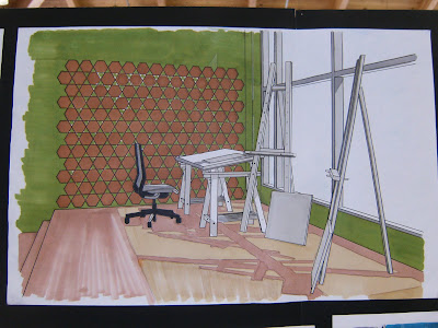
After weeks and weeks of this presentation, I realized that you're never really prepared for it. There's always things that you think are completely done and perfect, but once you begin to present it to a class, everyone can nit pick and think of things you could have or should have done in it's place. I learned that although I had some strong ideas, like the hexagonal shelving, I could have integrated that in the space more. Also, if I truly wanted to celebrate the studio area, I could have made it larger, or somehow made the living area more secondary in plan. In plans, it was pointed out to me that when drawing things, like rugs, I needed to draw them under the couch to make it clarified for the audience. There was no huge mistake that I made, it was all miniscule and nit picky criticism that I got, which I didn't mind, because if I were to go back and work on the studio space project some more, I would like to keep the main idea, but just do some touch ups along the way.
Friday, April 30, 2010
Final! Finally!


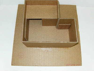
My final project! Whew! Overall, I really liked how it turned out. If I were to go back, I would have redone the model in another material...because foamcore is just not my friend. But other than that, I am really pleased with the outcome of this studio space project. It was a stressful and very time consuming project, but looking back...it was a real learning experience.
The process..
Friday, April 9, 2010
Color Schemes.


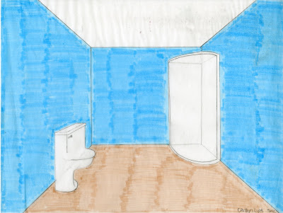
 With these color schemes, I didn't want to put any furniture in them. I want this area to have a wall color change to differentiate the zones of public to private, because this area is the bed/bath area. My artist is Damien Hirst, and since he is an eccentric artist, I think I've decided on going with the analogous scheme, but a little subtler...more like what is actually on the paper than what ended up coming through the scan, and doing mainly white furniture with pops of color with the pillows and accents. This assignment really has helped me progress in the project and helped me decide what direction to take the studio space.
Sustainability.
Subscribe to:
Posts (Atom)


