Showing posts with label IAR 112. Show all posts

Thursday, April 29, 2010

Clue #5, #6, #7.


Pimp my ride? Clue #5: Draw a car, basically.

Why not draw a muscle car?

Clue #6, #7: Make some change, have some fun...add some atmosphere.

I decided to make my car fly. I started from the from the start of the car and everything followed from there. I experimented with a scribbling technique, adding onto the stippling that our TA's showed us in class. I really liked how this assignment allowed us to transform something so, everyday, into something extraordinary and literally, out of this world :).


Tuesday, April 27, 2010

Clue #2, #3, #4


Clue #2: Develop a series of 25 patterns coming from one inspiration piece. Feel free to exaggerate, repeat, layer, and zoom.

With this...I actually had the most trouble. For the first 15 or so, it wasn't bad, but for the last 10, I started slowing down and it was harder to think of patterns and to let myself use the techniques of exaggerating, repeating, layering, and zooming in and out.


Clue #3: Construct a one-point perspective of a small reading area. Include 3 patterns.

This was a little easier...until it came to choosing the third pattern. I had a hard time deciding where it should go, how large it should be, and how much of the space it should take up. I was scared it would be pattern vomit. :(.


Clue #4: Make 3 copies of your reading area and picking a palette of no more than 4 colors, explore what happens when the colors are applied in different ways and amounts in each perspective.

I really enjoyed this clue. I've figured out that I worked best with vignetting colored pencil. and not coloring the whole item. It's simple, yet it looks SO MUCH BETTER. The grayscale perspective looks kind of shabby to me because I was trying to see what it would look like if I colored all of the bench instead of just splashes of color, and I didn't like how it turned out. However, for the other two, I really like how there is barely any color but you can still get the effect of the warmth of the rooms. I just wish the scanner would have picked up on it more :(.


Wednesday, April 21, 2010

Clue #1


First clue: Draw two public spaces that have meaning to you. Well...when I read this...the fountain and the quad were the first places that popped into my head. I was in a kind of 'stick your headphones in and see where it takes you kind of mood' and I definitely thought that these two places are two of the most known for hanging out and relaxing. The fountain, to me, is a place where I always meet people, so it's like my 'landmark' of UNCG, and it's also a place where I can just sit and 'let my troubles roll by'. The quad, on the other hand, is a place where my Greek Life began. It's where I ran home to ADPi and where I'll be living next semester, so there's a comforting feeling that surrounds me when I'm in the quad.

I know this is going to be a really fun and relaxing assignment. I can't wait to see what the other clues are going to be.

Thursday, April 15, 2010

Monticello/Fallingwater


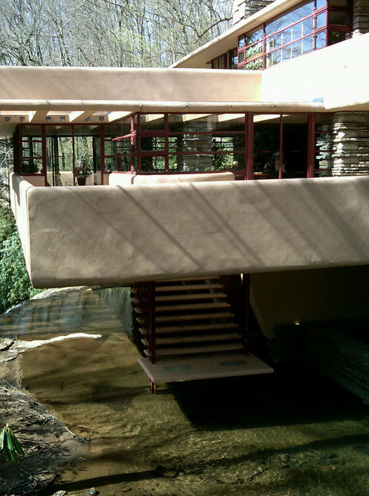
This was by far one of the best field trips that I have been on. Fallingwater is quite possibly my new favorite place. I love the way that it integrates every little part. Whether it be the interiors with the exteriors of nature, or the furniture with the structure itself. I'm amazed by Frank Lloyd Wright's genius in the fact that he was only on the site one time and drew the plan in about three hours and came up with something so amazing. Monticello and Fallingwater both are architectural marvels in which they were so far ahead of their time. I can't wait to go back to both of these places! And hopefully get to spend more time venturing out and exploring!


Thursday, April 8, 2010

In Living Color.


Markers on Marker Paper


Watercolor on Watercolor Paper


Colored Pencil on Canson Paper


Watercolor on Marker Paper

This was a really fun assignment. I really enjoyed experimenting with different materials/media. It was interesting to see all the different reactions. Now, looking back on the assignment and seeing my classmates projects, if I could do it over, I'd like to take more risks in the materials I use and how different each section is compared to the next one.

'Draw me!'

The Graduate Park is a place that I walk through everyday. It's a place that I find completely inspiring. There's just something about it. It's serene and in a way, to itself. It's this different area of campus thats, well, special. That's why I decided to draw this. It's the one place that speaks to me on campus and it's a place that I can go and sit for hours and let my creativity crawl.

Tuesday, March 30, 2010

Chartpak Adventures :)!


Today, we colored/rendered for the first time with Chartpak markers. I've found a new love for markers. They're easier to work with than watercolors or colored pencils. And you can manipulate them easier by mixing colors or adding colored pencil to achieve your goal. Thanks, Suzanne, for a fun class today...I enjoyed 'going back to kindergarten' :).

Monday, March 1, 2010

Sketch Sketch Sketch.


More Mossman...

This week, we're supposed to have 5 sketches of details of the Mossman Building, using influences of other artists. Here's the progress of mine..


go2.wordpress.com.jpg

Pete Scully


I haven't added color yet...more tomorrow!

Thursday, February 25, 2010

Mossman Thumbnails.


For the past week and next week or two, our project in our drawing class is on a specific building. My group is in charge of the Mossman Building. Here is my drawing assignment for the week: 12 thumbnail drawings of details of the Mossman Building.

Monday, February 1, 2010

Accessories.


For this assignment, we were supposed to zoom in on accessories and begin to play with water color, and include some colored pencils as well. The bottom page was my first attempt with water color...and well, it didn't turn out as well as expected. However, with the earring...I really liked how it turned out, so I decided to play it up with a blue-green background to make it pop.

Thursday, January 28, 2010

First week back?


My inspiration, folks.

I really liked this magazine layout. It was from the IIDA 'perspective' magazine Winter 2009 edition. I liked how well it represented my first week back. For those who don't know...our assignment this week was to find a magazine layout and recreate it somehow, representing our first week back at school. So I decided to pile up all of my events, to show my chaotic week, and how I've had to do things from 'a new angle'.

New semester. New sketchbook.


As our first sketchbook assignment, we were instructed to go in our rooms/studio and find 5 objects that have meaning to us and to draw them, using pen and one colored pencil. On the left page, I drew the things that were more or less ritualized to me. Like my medicine container and my room number. My medicine container holds my Topamax, which keeps the migraines away, and the room number is my home...it's where I always end up. But the things on the right are the things I take pride in, and the things that mean the most to me. Like my religion, my bible. Or my ADPi, my sorority, my best friends. Or my love and my memories. These are the things that I can't always explain, but I'll cherish for the rest of my life.